

Rethinking the Drawer: From Bottleneck to Scalable System
Overview
Videri’s Portal3 uses drawers throughout the product to give users quick access to Devices, Walls, Assets, Playlists, Campaigns, and other objects.
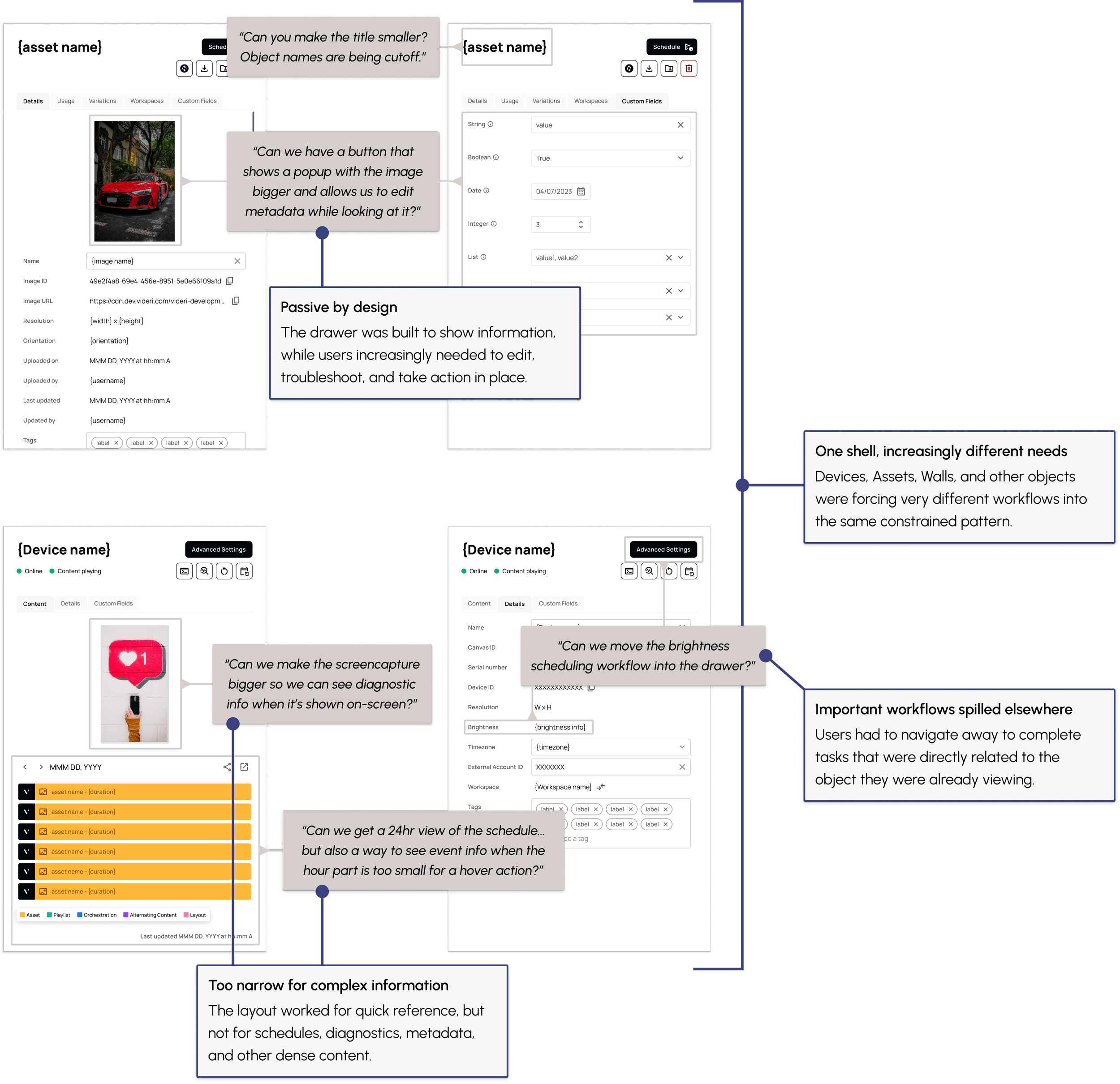
Over time, those drawers started doing much more than they were designed for. Users wanted to edit metadata, understand usage, review schedules, troubleshoot devices, and take action without leaving their current context.
What looked like a growing list of unrelated feature requests pointed to a larger problem: one of the product’s most common interaction patterns was no longer scaling with the product around it.
What I owned
I identified the shared problem across multiple requests, defined a reusable drawer framework, and designed how that system would adapt across several core Portal3 objects.
Role + Scope
Sr. Product Designer → Product strategy, interaction design, information architecture, design system
The pattern was the problem
The original drawer worked well when its job was simple: show a few details without taking users away from the page.
But the work happening inside it had changed.
Users increasingly needed to:
Preview and manage visual content
Edit metadata and custom fields
Understand where an object was being used
Review complex schedules
Diagnose device problems
Access object-specific controls and actions
Solving each request independently would have created an expanding collection of exceptions.
Instead, I reframed the problem.
The drawer didn’t need another feature. It needed a new definition.
Designing a framework, not a template
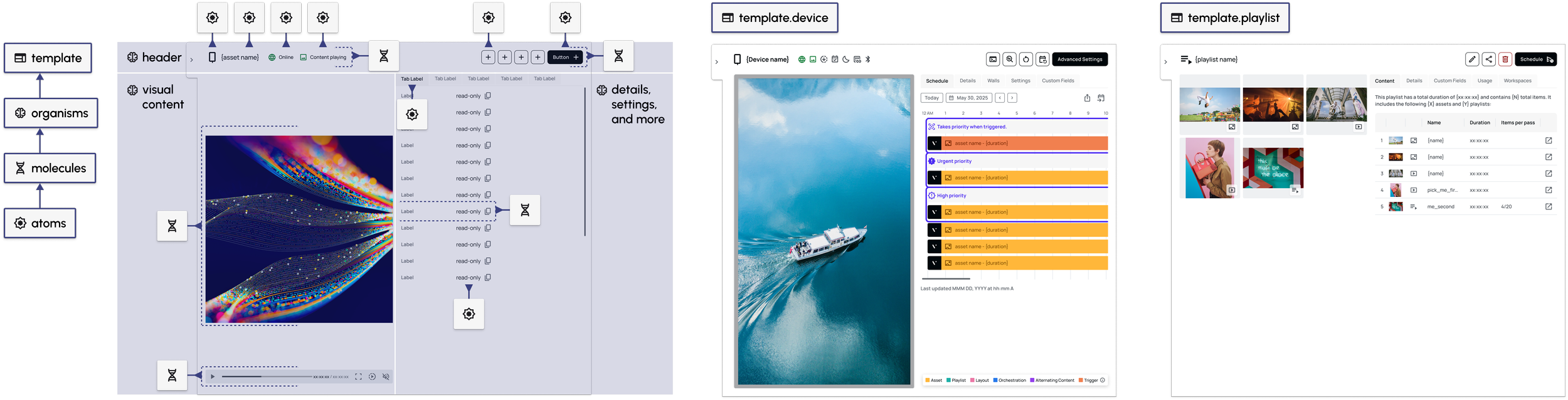
I wanted the drawers to feel consistent across Portal3 without forcing fundamentally different objects into the same layout.
That led to a small set of principles:

Keep users in context.
Let people understand and act on an object without unnecessary navigation.
Create consistency without uniformity.
Shared behaviors should be predictable, while each object retains the tools it actually needs.
Design for growth.
New information and actions should fit into the system without requiring another redesign.
The result was a modular framework built from shared structural patterns: object identity, primary information, expandable sections, contextual actions, and object-specific modules.
A Device could prioritize status and diagnostics. An Asset could emphasize preview, metadata, and usage. A Wall could make room for scheduling.
The structure stayed familiar even when the content changed.
Designing for the work inside
Rather than treating the redesign as a visual refresh, I used the new framework to rethink several workflows.
-
![]()
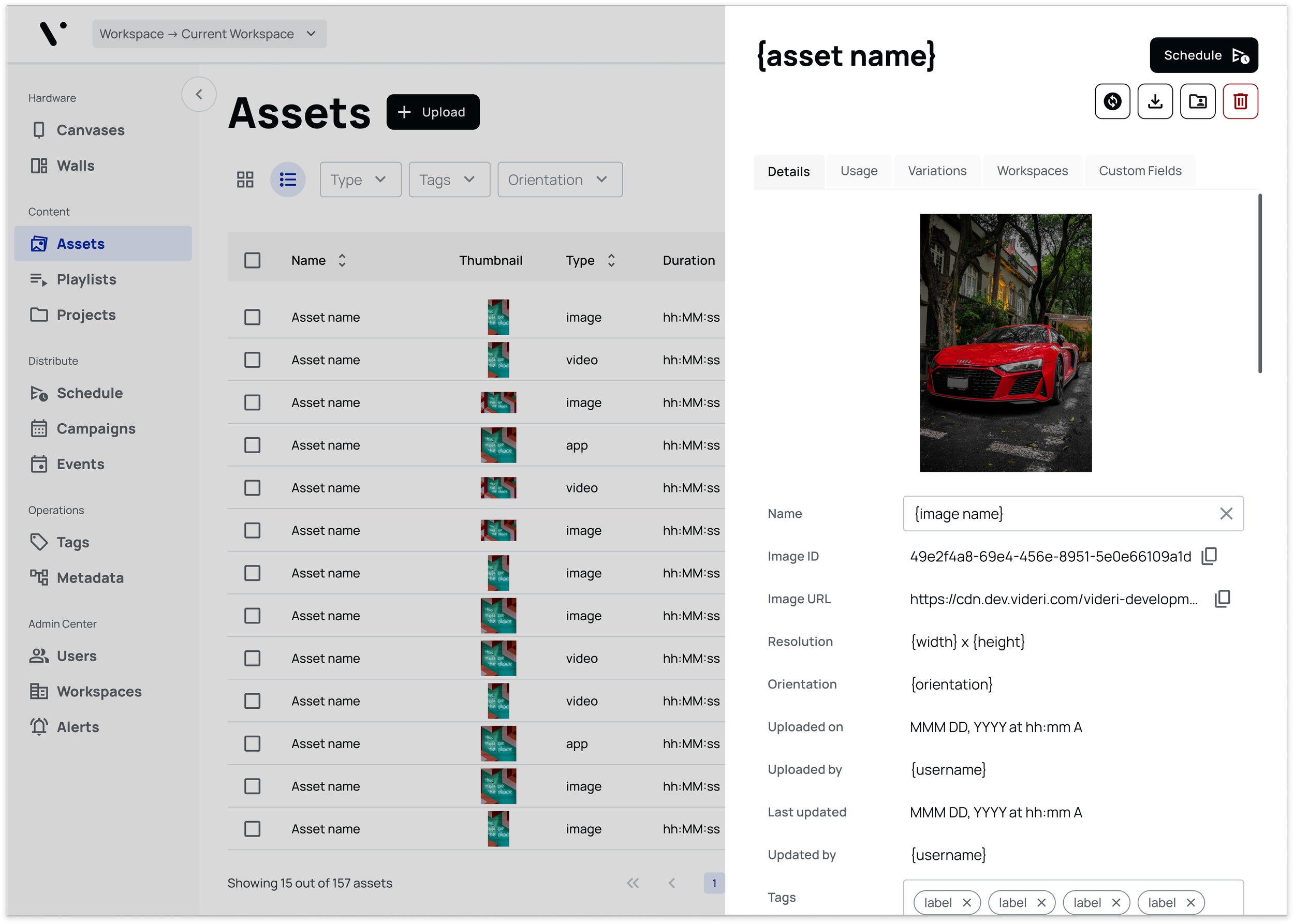
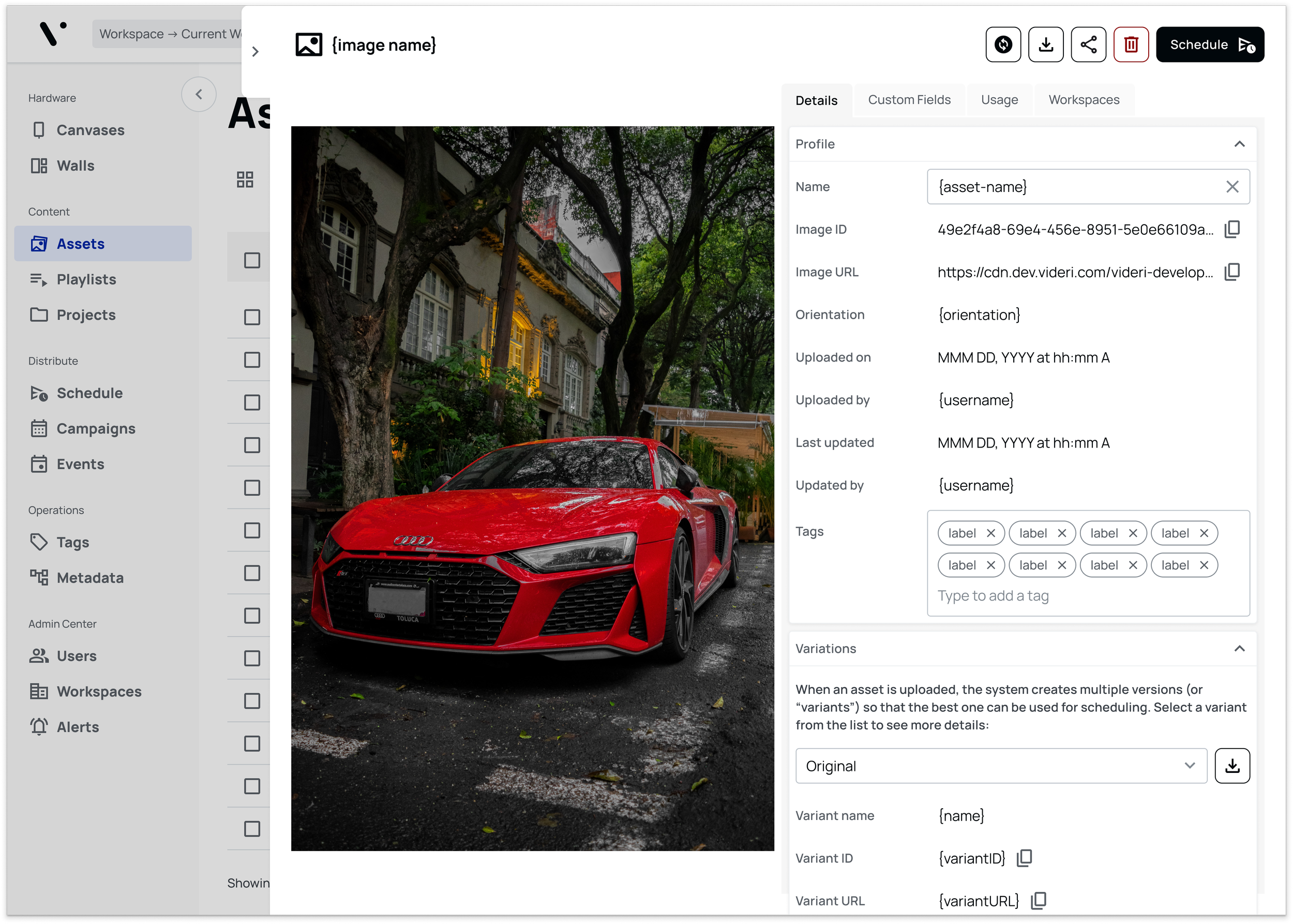
Making content easier to manage
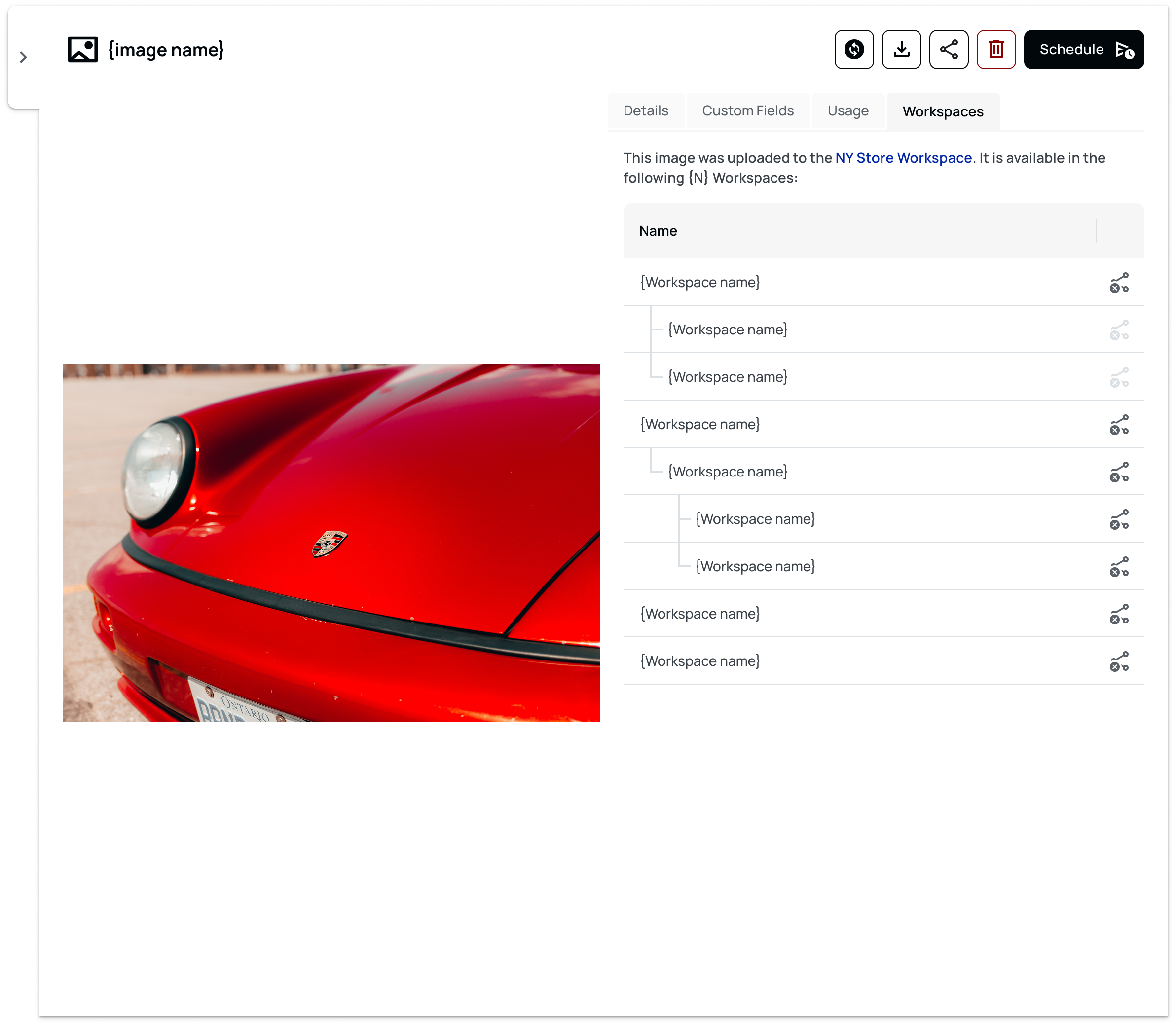
Content drawers gained enough room for meaningful previews, editable metadata, custom fields, and usage information.
Users could understand both what a piece of content was and where it mattered without moving through several parts of the product.
-
![]()
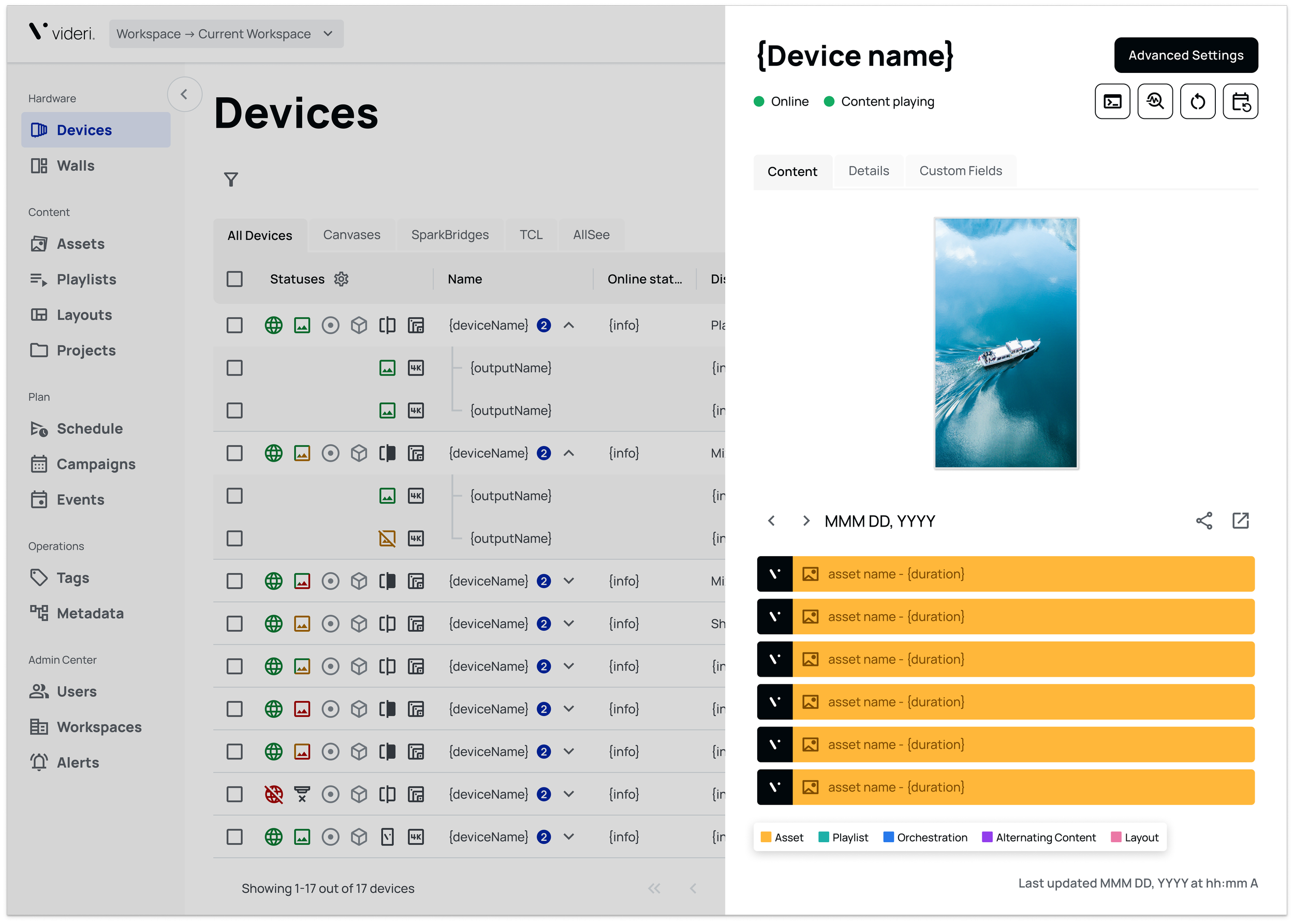
Bringing troubleshooting into context
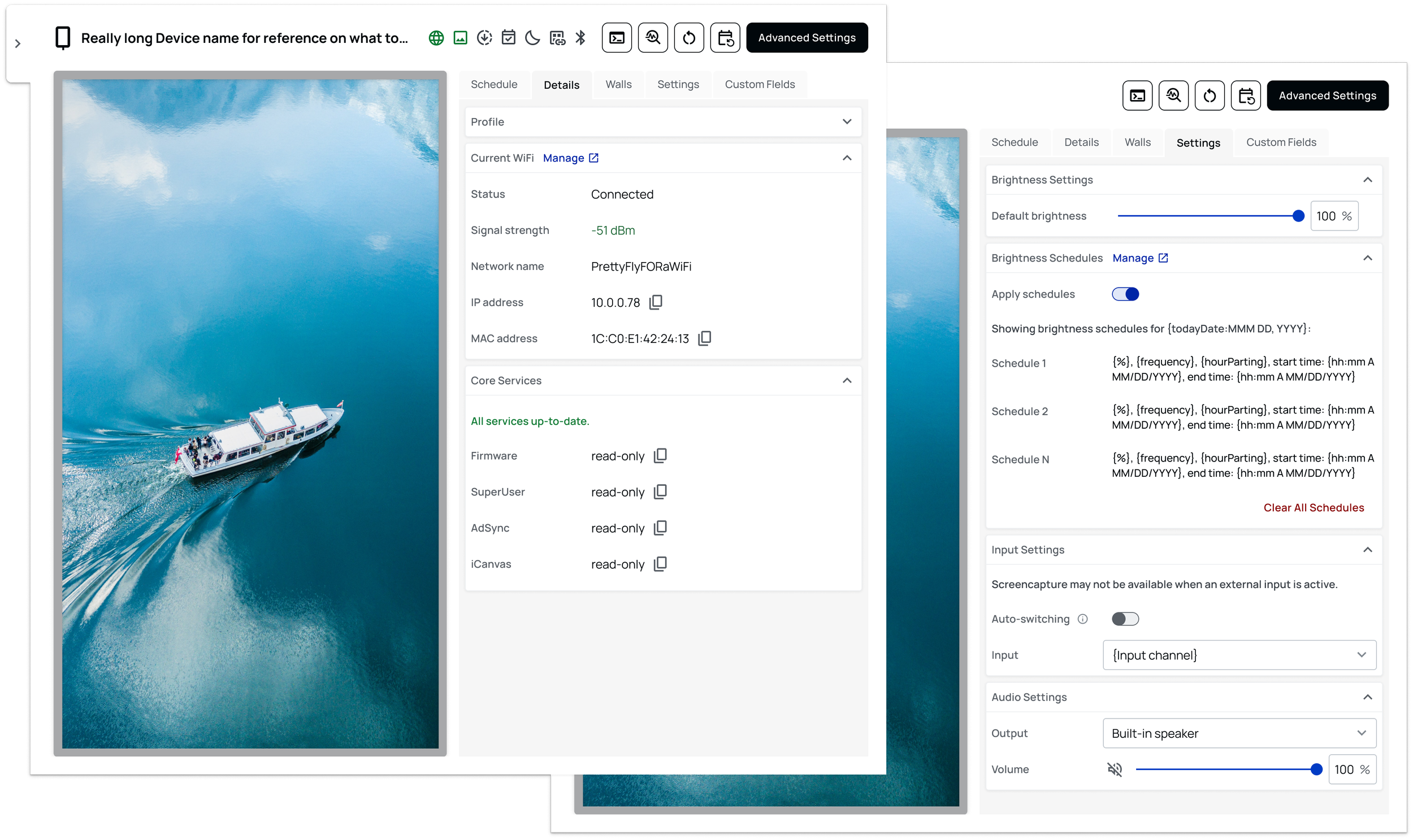
Device drawers brought status, diagnostics, screenshots, firmware information, and advanced actions closer to the device being investigated.
Instead of treating troubleshooting as a separate workflow, the drawer could become the place where users understood a problem and decided what to do next.
-
![]()
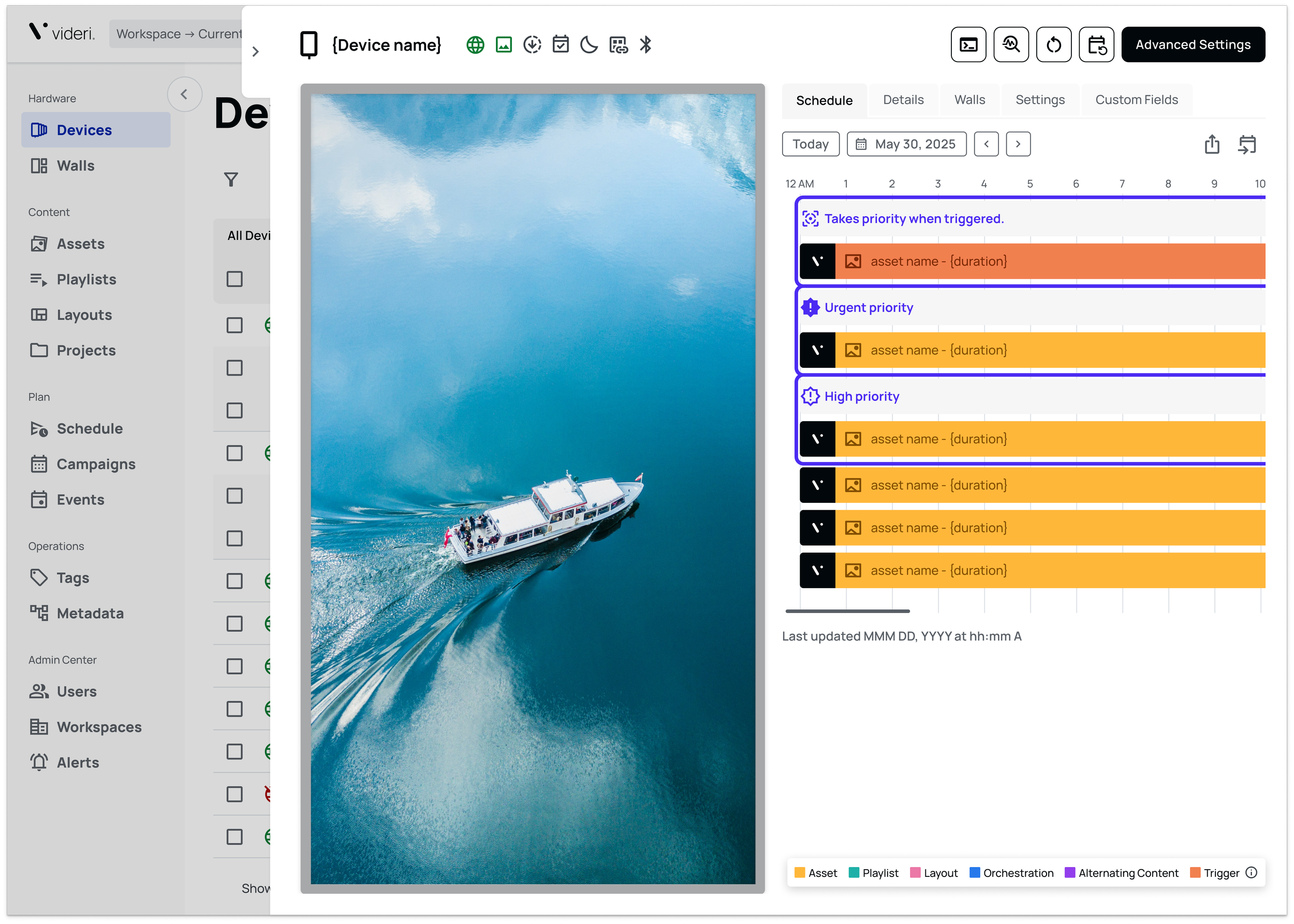
Making complexity easier to scan
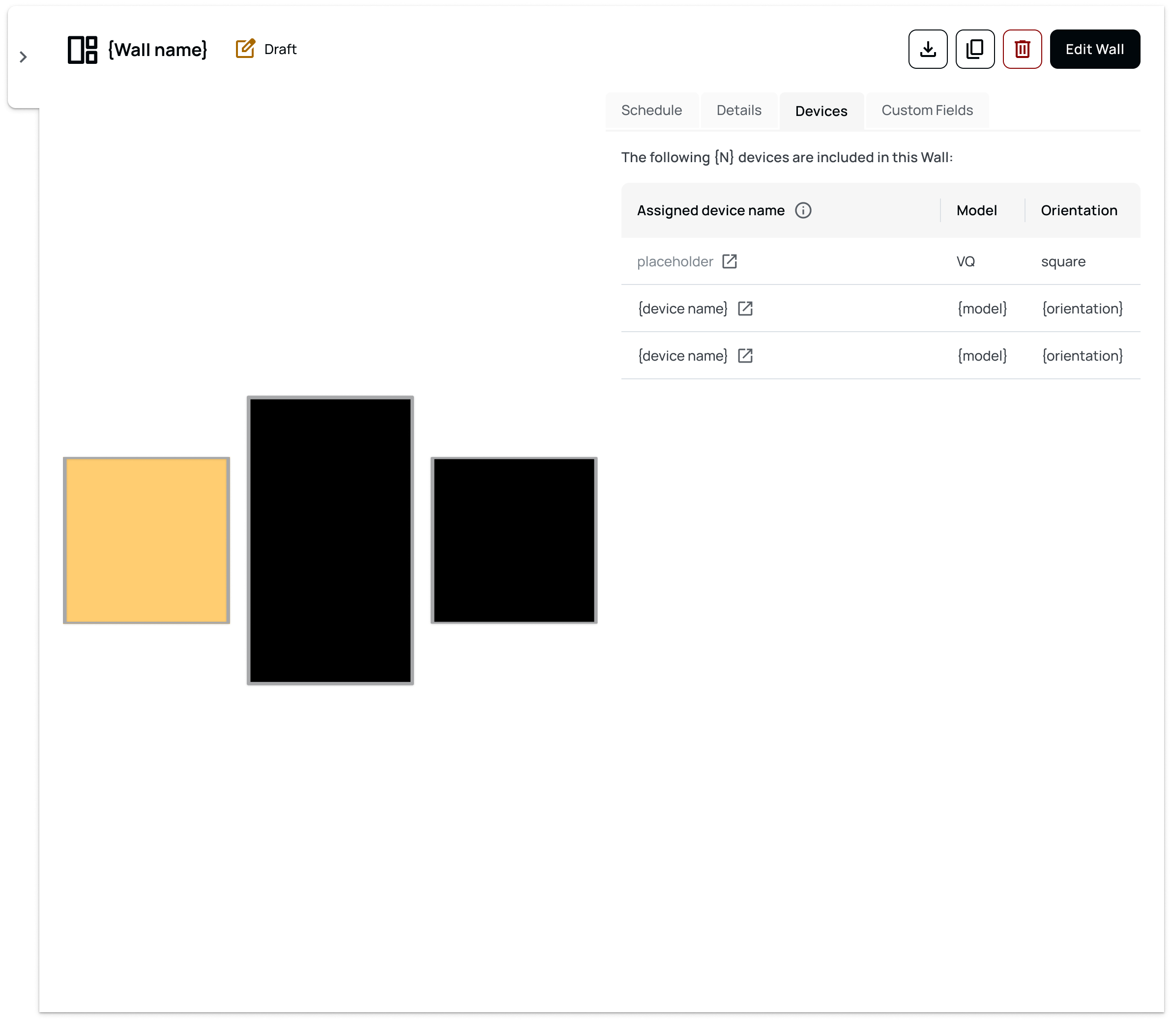
The expanded framework also gave dense information—such as schedules and Wall states—enough space to be useful rather than forcing it into a narrow panel.
One system, different jobs
The strongest test of the framework was not whether the drawers looked identical. It was whether they still felt related while solving very different problems.
Across Devices, Walls, Assets, Playlists, Layouts, Project, Campaigns, Users, and Workspaces, the new pattern created a shared interaction model while leaving room for object-specific functionality.
Predictability came from the system, not from making every screen the same.


From component to product infrastructure
The redesign solved the immediate usability problems, but its larger value was structural.
Instead of continually patching individual drawers as new requirements appeared, Portal3 gained a reusable framework that could absorb new information, actions, and workflows as the product evolved.
It also moved more work into context. Users could inspect an object, understand what was happening, and often act on it without repeatedly navigating elsewhere.
For me, the project reinforced an important lesson about mature products: when enough small feature requests accumulate around the same pattern, the real opportunity may be to redesign the system underneath them.